Lookout Mobile Security
Lookout is a mobile security platform that protects private citizens and the world's largest enterprises with intelligence from 100 million mobile sensors. In anticipation of two new product releases, Odopod was asked to reposition Lookout to appeal to an increasingly enterprise clientele and communicate their complicated product offerings more clearly. I worked on a team of three creatives to understand their products, illustrate their offerings, and hand off the most well documented designs the engineering team at Lookout had ever seen.
Lookout wasn't attached to their current visual language when they came to us – it was very tech-forward focusing on connected nodes and businessmen in suits.
We wanted to take them in a more editorial direction, and they gave our team a lot of latitude to explore new visual directions for the company. The creative team was very small and consisted of a high level Design Director, an Associate Design Director, myself as Art Director, and a Junior Designer.
Some early visual explorations
Lookout offers four mobile security products that work together through their "Lookout Security Cloud" to keep people's devices from being compromised. This relationship can get complicated so we spent time with each of their product directors to internalize and understand what they do.
Early on we realized there wouldn't be a way of representing Lookout's mobile products with photographs or app screenshots. The offerings were more abstract than that – they were piece of mind.
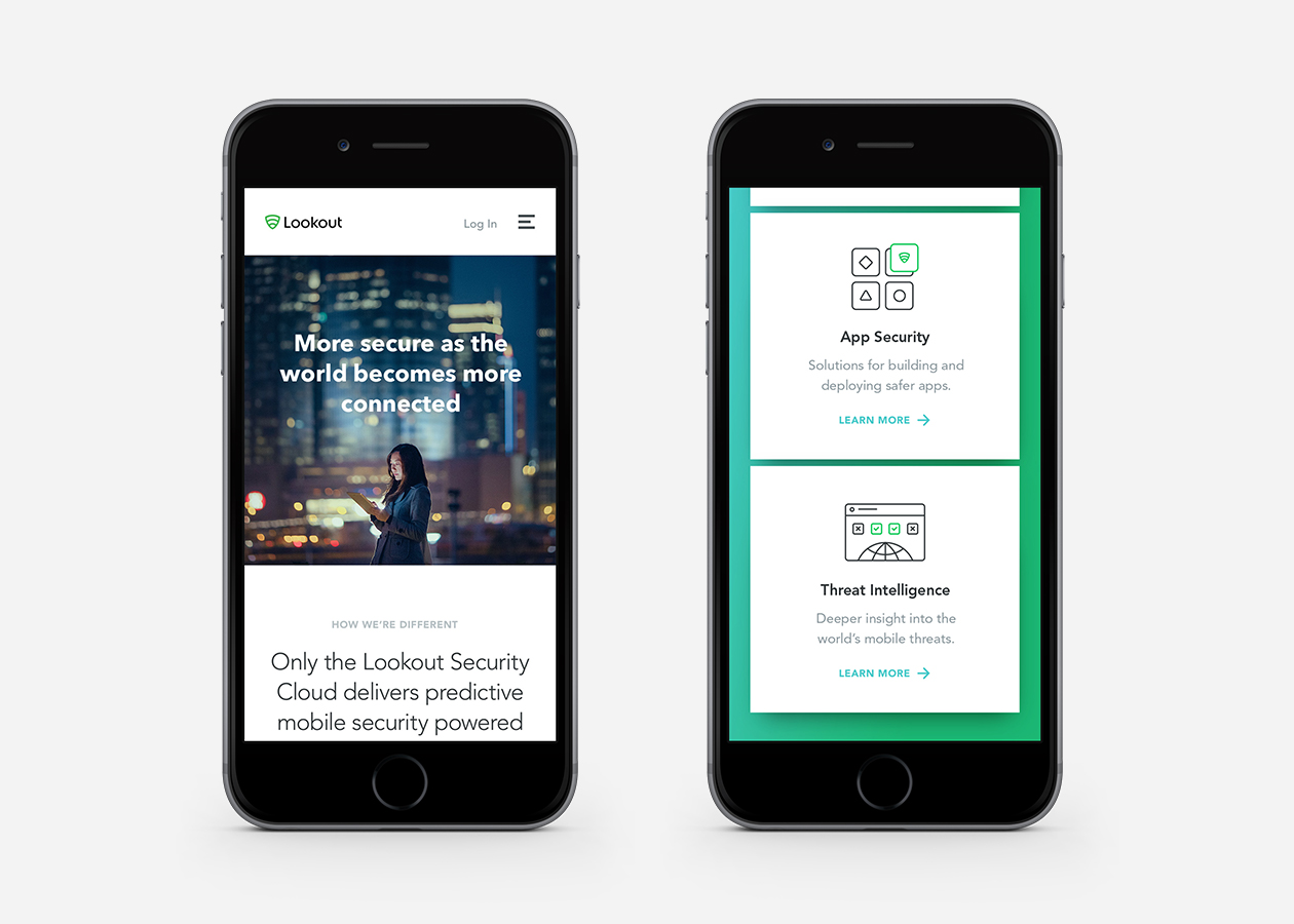
This led us down a spiraling path of product illustrations that went from just being stylistically challenging to getting twice weekly feedback from each product director. Visualizing these benefits was a whole team effort and Lookout was thrilled to have this style at their disposal for future products.
Illustration Style Explorations
Although marketing a series of mobile products may seem quite contained – explaining their relationship to each other, clearly proving their benefits, and allowing Lookout to continue to be thought leading publishers on mobile security is hard to do in a small package. We created heat-maps of each page to describe where we should educate, where we should be aspirational, and where we should ask users to take action.
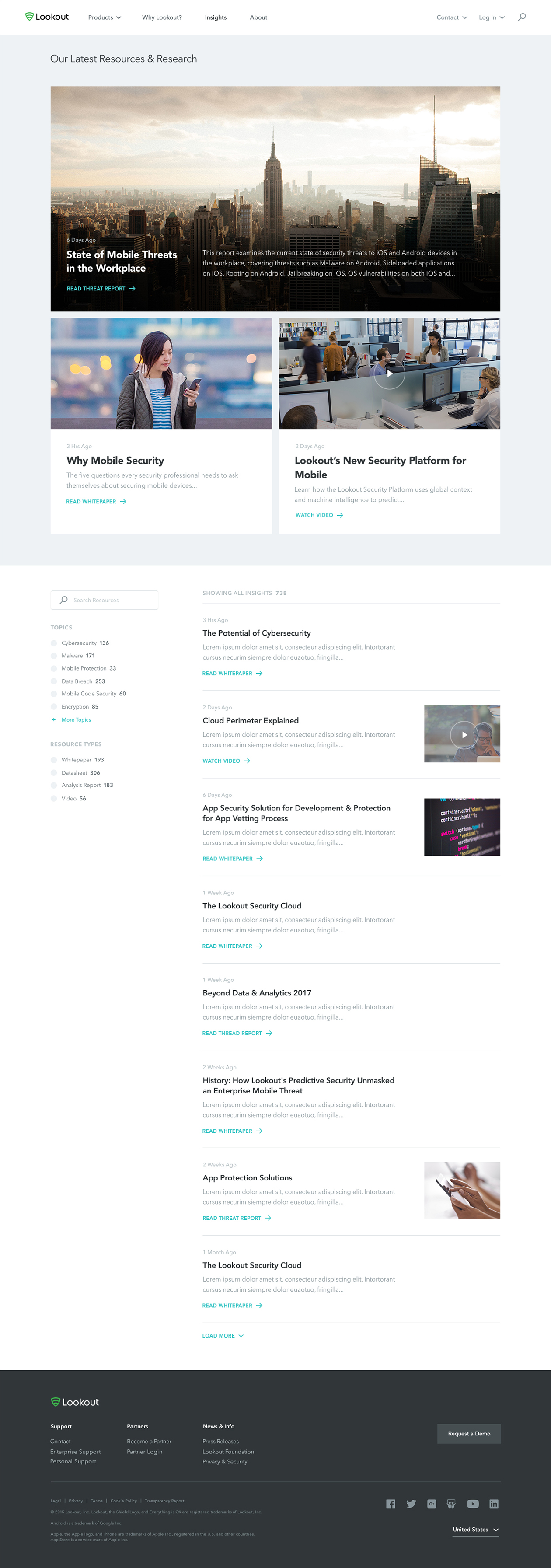
We delivered 11 uniquely designed pages and a robust system of modules powering 28 other pages.
Final Website Designs
Our clients at Lookout were a blast to work with. They felt the work we did was exactly what they had wanted. As the project began to wrap more responsibility fell on me to finish the design and module system as others were pulled onto other projects. I'm particularly proud to have made many of the design moves that are live on the site today.
I worked with Lookout's technical director to create a comprehensive style guide that made sense to his development team. I continued to spec all responsive pages, module designs and describe behaviors through animated prototypes. Their tech director was impressed and it shows in how well they adhered to the documentation in the live site.


